Marketing Ourselves Into the App Store Top Ten
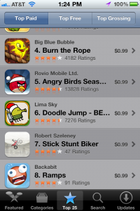 Today marks the two month point since Ramps was released on the App Store. In that time, we’ve had a crazy ride that neither Tyler or I could have expected, including five consecutive weeks of prominent App Store features. One of those weeks, Aplle gave us an iPhone Game of the Week mega-feature that catapulted Ramps into the US overall top ten.
Ramps also saw favorable press coverage from industry-leading outlets such as IGN, Appolicious, Download Squad and Slide to Play. We’ve been completely humbled and awestruck by the response, particularly because it’s the first game we’ve released (it’s actually the first game I’ve personally developed, too!).
We’ve had a lot of interest from our peers about how we managed to pull this off and what sales have been like, so I wanted to write a follow-up to share some stats and lessons learned from the process. Hopefully it will help other aspiring game developers achieve similar results.
Sales recap
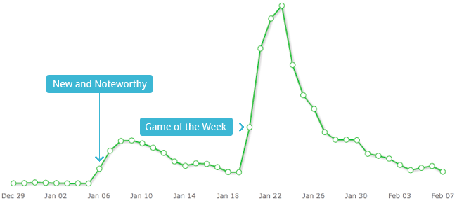
A picture’s worth a thousand words, right? Tyler and I don’t want to share specific revenue results publicly, but hopefully this chart from Flurry will give you a good idea of how we did. To give you a frame of reference, a Saturday at #8 in the App Store is worth about 10,000 units. I’ll let you do the math from there.
We’re pleasantly surprised by how well we’ve retained our users. People play Ramps again and again, which keeps us motivated as we develop our first major content update. As of today, Ramps has been played more than 850,000 times.
What went well (and what didn’t)
Obviously, Apple’s feature was our single biggest success contributor, but it took a ton of work for us to get there. I’ll focus on our marketing tactics below, starting with the most important:
Polish, polish, polish!
The best marketing you can do for a product is to make it as good as possible. Amazing products practically sell themselves.
We didn’t just settle for things looking and working right, but things had to feel perfect, too. As you can see from Tyler’s most recent post, which is a great example of how we went through several iterations of choices before settling on one, we wanted to make sure we only added what was right for the game, and that we executed flawlessly.
Early on, I started realizing how much work it took from a development perspective to bring some of Tyler’s visual ideas to life. I quickly adopted a “Why the heck not?” mantra. Tyler devised some wild ideas, often mentioning in his descriptions that he would totally understand if the effort level was too insane to justify.
The title screen (with world selection and the credits) was one such example. Tyler had this awesome idea that your initial encounter with the game would be this seamless experience where menu transitions were just camera movements up and down. It took more than 60 hours and 2700 lines of code to bring it to life, but our title screen experience became unique and interesting, so it was totally worth it.
Additionally, part of the polish is also in paying attention to details so tiny, that people might not even notice.
- Tyler really wanted to see parallax scrolling somewhere in the game, and we added it into the title experience.
- We change out the backgrounds and include scrolling stars when you’re playing at night (this pops up in other parts of the game, too).
- The blue ball’s eyes follow the world tiles as you swipe left to right to select a world.
- The world tiles scale dynamically based on how far you scroll them.
- You can actually swipe to move up and down throughout the title experience.
- The entire screen actually bounces when you move down in the experience.
- Our ball avatars in the credits move and animate randomly, like they have a little life of their own.
- The Game Center icon is custom-designed to actually look like it was made just for our game.
These are just a few examples from a single scene. The entire game is chock full of little details we would get excited about and add unquestioningly, because we knew it would make the experience a tiny bit better. I believe that’s why we were noticed. We made this game with love, like artisan experience creators, because we couldn’t settle for shipping a game that would be anything less than something we would be proud of for years to come.
Media coverage went well, but not at first
We shipped Ramps right before Christmas, and had enthusiastic support from our family and friends, many of whom were also beta testers. Our instinct was that shipping before Christmas would give us a sales spike. We were right about that (though it was small), but it also meant that every outlet was buried in coverage of new releases from the major players in iOS gaming (EA, Gameloft, etc.).
Rick Turoczy of Silicon Florist, a local Portland blog covering the startup scene here, was gracious enough to cover us and nudge us in the right direction in terms of media momentum. We’re both incredibly grateful for what Rick does for the tech community here, and that he persevered to actually play through Ramps and review it even while he was sick with the flu. Hopefully we kept him entertained while he recovered.
With other outlets, we made a list of about 50 media websites that we felt were a good fit in terms of their voice and content, and had a reasonable reach to help spread the word about our game.
I hate press releases. I think they’re impersonal and don’t enable you to really tell your story.
Based on this wild-hair belief, I somehow convinced Tyler that we should carefully craft a pitch e-mail describing who we are, that we’re scrappy, that we love what we’re doing, and that our first game Ramps is super awesome. I wrote the first draft, and Tyler edited it (he’s an amazing writer, by the way). The mail ended up being pretty long, but some of the writers we heard back from commented on how much they appreciated the coolness of our story. We included treated screenshots, our app icon, and a link to our promotional video.
Circulating the release didn’t go as smoothly as we hoped. I was using a Gmail plugin that allowed me queue all of the emails, sending them at the precise moment we launched. Tyler and I both have day jobs, and it’s generally a good idea to launch a product on a weekday (we chose Tuesday), because it fits in better with the weekly press news cycle. We needed to have a way to send out 50 emails while we were at our day jobs. This plugin worked well (I tested it first, I swear!), with the exception that it sent between three to eight copies of the e-mail to about 12 of the outlets! I was pretty heartbroken that I had just sabotaged our chances of getting any coverage. Fortunately, Tyler had a great idea spur of the moment (on a pivot—more on pivoting later) that we should quickly send a brief mail to the outlets apologizing for our mishap.
It took a while, but the reviews started rolling in—even from some of the sites I accidentally spammed!
One of my favorite stories in all of this is that Tyler wrote a special pitch to Download Squad, as they covered his original game back in 2007. The original review was mixed, but it was great to see them cover Ramps with glowing acclaim after we addressed every critical comment they had made years earlier.
Having a $0 marketing budget went well
I’ve never had any success paying for advertising or other forms of marketing on any of my previous side projects. If you’re smart and resourceful enough to create a mobile game, then you should be able to market your product in the social era for cheap, maybe even nothing.
We didn’t invest any capital into marketing, and instead opted to be resourceful. Tyler built this blog, and our website, as he has killer web development chops. He created a lot of additional marketing collateral to support our social effort so that we’d have a branded Twitter presence.
I created our promotional video with screen capture software and iMovie. I spent time lurking and contributing to the Touch Arcade developer forums reading posts like these to learn from the marketing successes of others. It was there I identified an opportunity for us to participate in the New Year’s App Blowout, an annual sale organized by indie developers to get under-appreciated titles more exposure.
Tyler and I have different strengths, and we both found and executed on our marketing niche. I feel fortunate that I’m lucky enough to be working with someone who greatly complements the gaps in my skill set.
As many others before me have stated, your best shot at success is getting noticed by Apple. Your best shot at getting noticed by Apple is through the press. Do your best to make yourself interesting, and the press will write about you.
Our pricing strategy went pretty well
We shipped Ramps at $2.99, and we got some criticism for it. Mobile app consumers aren’t too thrilled about paying this much for casual titles, with the exception of premium titles from big-name shops. We read about the Canabalt story, and how they took a risk and stood-up to the race-to-the-bottom pricing of iOS gaming, and decided to take our own shot at higher pricing. Ramps has a lot of content, and while early sales were promising, we weren’t too thrilled with what reviewers were saying.
After our Apple features, we dropped to $.99 where we stayed for several weeks to ride the App Store ranking wave. We’ve since raised our price to $1.99, and sales have continued their inevitable decline at roughly the same rate as they had at the $.99 price point. I think $1.99 for our game is something customers can grok a lot more than $2.99 for a casual title because they’re getting an experience with more content than many quick, casual time wasters.
Loose planning, measuring, and pivoting went great!
I was blown away with our ability to make quick-twitch marketing decisions based on data. We use a number of tools for monitoring coverage and getting alerts, monitoring social channels, as well as app utilization, sales and ranking analytics. Some of our favorites include Flurry, App Annie, MajikRank and appFigures.
Tyler is currently making me read Rework, and my favorite takeaway from that book so far is to avoid overplanning. You can’t anticipate what is going to happen with your product or a market, all you can do is prepare the best you can to pivot in the right direction when change and adversity happens.
Our first release received some negative reviews from users who had crashing issues. After some research, we discovered it was from players on older devices who didn’t have enough memory available. In order to pivot, we improved the issues and also added a prompt to periodically encourage players to rate the app. The result was our following release received more favorable user reviews, and a significantly lower percentage of them were negative. This really helped us, as having positive user reviews helps improve your app’s perception, which in turn drives more sales.
For next time
We have a wicked-awesome roadmap planned for Ramps, but eventually, we’d love to create another title. The next time around, I think we should start the marketing process sooner. This seems to be a common lesson-learned amongst indie game devs, as marketing is often the most overlooked phase in the process.
Being more active in the indie game community, and approaching the development process in a public forum gives you the best shot for organic exposure. Doing this gets gamers excited about the work you’re producing, and gives them the ability to give you feedback on development as it’s progressing.
This was a major opportunity we missed this time around, and while things worked out great for us anyway, if we want to repeat our success, we’re going to need to explore more marketing channels.
Overall, we couldn’t be more stoked about how Ramps has turned out. Tyler and I are both excited to be continuing to push forward with our continued plans for Ramps, and are looking forward to sharing much more of our progress this time around.


 The first version of the icon was created early on, and used for much of the development process. I’d grown so used to this symbol in Angry Birds that I incorrectly assumed the rest of the world would make the same association. During the beta for Ramps, I witnessed some confusion among players in deciphering its meaning, which kicked off the redesign process.
 Sometimes it helps to borrow design conventions the player may already be familiar with just from using the device itself. I noticed that iPhones and iPod Touches often used text-based buttons like “Back” to return to a previous screen, and click-wheel iPods use the word “Menu” in lieu of iconography. While this made sense in my head, in practice the result is far too sterile, and it stuck out like a sore thumb next to the other icons.
 I wanted to avoid using any sort of globe or planet icon because of the association with networking and web browsing, which I thought would hinder the player’s ability to decipher the meaning. Instead, I chose a symbol even more weighted with contradictory meaning (oh, the irony!). This felt too much like you’d be returning to the main menu instead of the world map, so I scrapped it quickly.
 After realizing the error of my ways with the house symbol, I admitted defeat and tried out a globe. I thought it was cute, but the aforementioned concerns over its implied meaning remained.
 A friend suggested I use a loopy line similar to the shape of the water on the world map, which was a great idea, but it just didn’t translate when the shape was small and monochromatic. Still, I thought there might be something to the idea of a literal “map,” which led me to this option. It still relies far too much on verbiage, and it doesn’t look friendly enough.
 I returned to the globe, but wanted to see if I could differentiate it from networking icons with some extra details. Although I like the result, ultimately those details are superfluous; they don’t make it any more understandable in the context of the game.