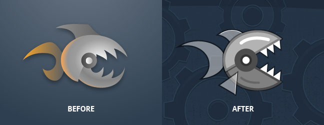
Video: Making the Piranha

When I made the original Ramps, I didn’t give much thought to its visual style. It was basically a glorified tech demo, an outlet for the skills I was learning from Keith Peters’ Foundation ActionScript Animation book (which has since been succeeded by an ActionScript 3 edition). I look at the game fondly as the spirited product of an enthusiastic student (albeit one who was way too excited that Flash had support for gradients and bitmap effects).
I’m fascinated by the recent resurgence of pixel art and retro gaming, particularly in wonderful games like The Incident and Scott Pilgrim vs. the World. Nostalgia is certainly a part of the appeal, but a deeper design principle is also at play. I believe the limitations of low-resolution artwork forced the game makers to be extremely selective, resulting in visuals refined in simplicity and character. For example, Shigeru Miyamoto credits dismally low pixel resolutions as the cause for Mario’s distinctive cap and mustache:
The technology of the time really dictated how we did character design. If I gave Mario a lot of hair you have to animate it or it doesn’t look right. By giving him a hat we didn’t have to worry about that. We also didn’t have to draw his eyebrows, his forehead or any of these other things. It was just a really useful tool to help us emphasize what we were trying to do on this small screen.
In designing Ramps for iOS, my goal was (and continues to be) to capture that same focus and restraint while embracing the richness of contemporary displays. I admit the ambitiousness of this challenge, but it’s hard to regret something so fun to pursue.
I honestly didn’t know how well the original game’s piranha enemy would translate to the minimalism of Ramps’ new direction, especially since it relied so heavily on a metallic appearance. I decided to capture the translation from start to finish for posterity, sped up for your convenience and enjoyment. I hope you dig it!
