Designing the Robot
All of my character designs begin in a sketchbook. I find it’s faster, easier and more fun to brainstorm ideas with a pencil than it is with a mouse or tablet.
Most of the characters in Ramps are really simple. I wanted them to be really easy on the eyes and void of unnecessary distractions so that the game mechanics and emotive qualities of the designs could take center stage. This is also just a practical reality of dealing with mobile devices, since oftentimes the characters will be really small.
One of the few places I strayed from this was in the “world mascots,” the little characters that provide helpful guidance if you need it. Since they could be larger than most of the in-game objects, I got to explore a few weirder ideas just for the fun of it.

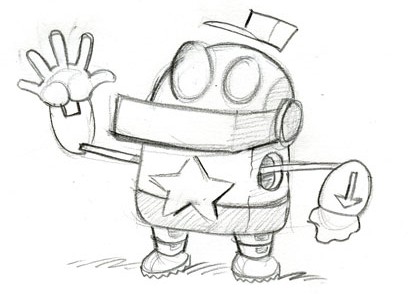
The idea of the little robot maintenance man had been in my head for a little while, so this sketch came very painlessly. Once I started applying him to the world, though, a few challenges arose.
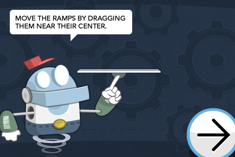
I realized I had inadvertently channeled a bit too much of Homestar Runner with the star on his shirt. Also, I hadn’t thought about how he would exist in a land of lava floors when he had to stand on two feet. Even the Terminator couldn’t win against lava.

I ended up giving him an undershirt and a belt buckle simply because it made me laugh. After a few false starts trying to render dangling legs, I settled on more of a Jetsons-style hovering animation that Tim executed on beautifully.
The World 2 mascot had a different design journey. I’ll be sure to show it in a future post.
