 We hope you enjoyed our little April Fools Joke. If you’ve never heard of the Nokia N-Gage, please take a moment to educate yourself.
Do rest assured that we have been keeping busy on Ramps 1.1. What we’re sharing here is a peek (the smallest possible) at a major new addition.
All we can tell you is… a mysterious portal has appeared!
Stay tuned.
Tim and I continue to be astounded by the success of Ramps for iPhone and iPod Touch. Tens of thousands of players have spent over a combined decade playing the game. As happy as we are with that audience, our inbox shows that there are many more players on other platforms waiting for their chance to play.
We’ve received hundreds of emails suggesting a Ramps port for just about every smartphone platform. Android and Windows Phone 7 have been particularly popular requests but, going on email volume alone, one suggestion dramatically outperformed all others.
That’s why Tim and I are elated to announce that Ramps will soon be available for the Nokia N-Gage QD handheld!
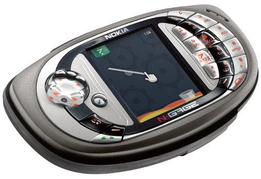
We knew it would be painful for N-Gage users to go Ramps-less as long as they did, but we think you’ll find it worth the wait; the N-Gage QD is truly the perfect platform for this title. Even if you’ve already purchased and enjoyed Ramps for iOS, we think you’ll find a lot to love in the N-Gage version.
The first thing you’ll notice is that Ramps for N-Gage features 100% more tangible controls than its iOS predecessor. Solving puzzles is as easy as 1, 2, 3:
- Use the d-pad to move the cursor to the editable ramp point you’d like to manipulate.
- Press 5 to select the point, then use the d-pad to make your adjustment.
- If you’d like to adjust other editable points, press 5 again to exit editing mode for the current selection. Otherwise, press 7 to dispense the ball!
We’ve cut the width of Ramps levels down 50% to accommodate the N-Gage’s unique 208 x 176 pixel display (retina if played from a distance of 48 inches or greater). Shorter levels means faster play, which means you’ll have more time for work, school and leisure activities.
Essa’s catchy soundtrack has never sounded clearer than in crisp 16kHz mono, and with the N-Gage’s built-in Bluetooth radio, you can easily transfer bitmap images of your achievements to a PC to share with friends on MySpace or your favorite newsgroup!
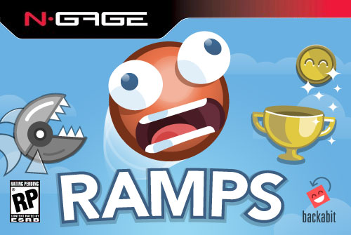
Shortly after ESRB finishes rating the game’s content, Ramps will debut in your local Electronics Boutique or Cingular Wireless outlet for the low price of $34.99. We think it will be regarded as the quintessential version of our little app.
 Tim and I will give a talk on the making of Ramps on Thursday, May 26 at the WebVisions conference.
The fast-paced, fifteen-minute session is just one of a zillion awesome talks at this year’s two-day event (three if you’ve signed up for a workshop). Register before April 5 to nab the early bird rate!
The full session description:
GO! How Two Guys Made a Successful iPhone Game and Lived to Tell the Tale
Time: Thu May 26, 11:45 am – 12:00 pm
At over 300,000 applications and growing, the iOS App Store is a thriving platform. But with great size comes great competition, especially in the coveted “Games” category. In this session, Backabit co-founders Tyler Sticka and Tim Sears explain how they took their first iOS game, Ramps, from student project to app store success. You’ll learn how they built the game without disrupting their full-time jobs, how they facilitated a successful design/development collaboration, what they’d do differently their second time around and lessons learned along the way.
Ramps (based on Tyler’s award-winning Flash game of the same name), was selected by Apple as an “iPhone Game of the Week,” ranking highly in the US App Store Top 10. It’s been played over a million times since its debut. Ramps has received numerous positive reviews from publications like IGN, Slide to Play, Appmodo and Download Squad. Apple called the game “a simple and stylish physics puzzler you won’t want to put down.”
For more info, visit the rockem’ sockem’ WebVisions site. We hope to see you there!
Oftentimes, the smallest details present the largest design challenges. For example, the “World Map” icon in Ramps, which underwent six revisions before a solution was decided upon.
 The first version of the icon was created early on, and used for much of the development process. I’d grown so used to this symbol in Angry Birds that I incorrectly assumed the rest of the world would make the same association. During the beta for Ramps, I witnessed some confusion among players in deciphering its meaning, which kicked off the redesign process.
 Sometimes it helps to borrow design conventions the player may already be familiar with just from using the device itself. I noticed that iPhones and iPod Touches often used text-based buttons like “Back” to return to a previous screen, and click-wheel iPods use the word “Menu” in lieu of iconography. While this made sense in my head, in practice the result is far too sterile, and it stuck out like a sore thumb next to the other icons.
 I wanted to avoid using any sort of globe or planet icon because of the association with networking and web browsing, which I thought would hinder the player’s ability to decipher the meaning. Instead, I chose a symbol even more weighted with contradictory meaning (oh, the irony!). This felt too much like you’d be returning to the main menu instead of the world map, so I scrapped it quickly.
 After realizing the error of my ways with the house symbol, I admitted defeat and tried out a globe. I thought it was cute, but the aforementioned concerns over its implied meaning remained.
 A friend suggested I use a loopy line similar to the shape of the water on the world map, which was a great idea, but it just didn’t translate when the shape was small and monochromatic. Still, I thought there might be something to the idea of a literal “map,” which led me to this option. It still relies far too much on verbiage, and it doesn’t look friendly enough.
 I returned to the globe, but wanted to see if I could differentiate it from networking icons with some extra details. Although I like the result, ultimately those details are superfluous; they don’t make it any more understandable in the context of the game.
I tried out nearly all of these variations on family and friends, but ran into a problem. For every person who disliked a particular solution, there was always an equal amount of people who preferred it! It was a draw every time.
The icon we included in the final game is the simpler globe (the fourth variation above). Aside from feeling it meshed stylistically with the rest of the game (which is, as you may have noticed, heavy on circles), I also liked that it depicted a “world,” which is the term we use to refer to each map of levels.
That said, I always reserve the right to change my mind later on. What do you think? Did we make the right decision?
Even outside of Backabit, Tim and I work at the same company.
The afternoon of January 20, he came by my cube and said “check out the app store today.” Our coworker (and awesome artist/designer) Calvin Ross Carl captured my surprise (appropriately, with his iPhone 4).
 We hope you enjoyed our little April Fools Joke. If you’ve never heard of the Nokia N-Gage, please take a moment to educate yourself.


 The first version of the icon was created early on, and used for much of the development process. I’d grown so used to this symbol in Angry Birds that I incorrectly assumed the rest of the world would make the same association. During the beta for Ramps, I witnessed some confusion among players in deciphering its meaning, which kicked off the redesign process.
 Sometimes it helps to borrow design conventions the player may already be familiar with just from using the device itself. I noticed that iPhones and iPod Touches often used text-based buttons like “Back” to return to a previous screen, and click-wheel iPods use the word “Menu” in lieu of iconography. While this made sense in my head, in practice the result is far too sterile, and it stuck out like a sore thumb next to the other icons.
 I wanted to avoid using any sort of globe or planet icon because of the association with networking and web browsing, which I thought would hinder the player’s ability to decipher the meaning. Instead, I chose a symbol even more weighted with contradictory meaning (oh, the irony!). This felt too much like you’d be returning to the main menu instead of the world map, so I scrapped it quickly.
 After realizing the error of my ways with the house symbol, I admitted defeat and tried out a globe. I thought it was cute, but the aforementioned concerns over its implied meaning remained.
 A friend suggested I use a loopy line similar to the shape of the water on the world map, which was a great idea, but it just didn’t translate when the shape was small and monochromatic. Still, I thought there might be something to the idea of a literal “map,” which led me to this option. It still relies far too much on verbiage, and it doesn’t look friendly enough.
 I returned to the globe, but wanted to see if I could differentiate it from networking icons with some extra details. Although I like the result, ultimately those details are superfluous; they don’t make it any more understandable in the context of the game.