Quote: “It’s not good enough until…”
It’s not good enough until you’re constantly worried about whether it’s good enough.
From an email conversation with Neven Mrgan, co-creator of The Incident, possibly my favorite iOS game. Smart guy!

It’s not good enough until you’re constantly worried about whether it’s good enough.
From an email conversation with Neven Mrgan, co-creator of The Incident, possibly my favorite iOS game. Smart guy!
I was interviewed by Corey Paul of Oregon Business Magazine for a story about the latest iterations of the classic Oregon Trail series of games. The article is available online, but I thought readers of this blog might dig my unabridged thoughts on why educational games have trouble making money:
Educational games and profitability is a bit of a “chicken and egg” scenario. If every educational game was as novel, fun and appealing as Oregon Trail, I’m sure they’d have no trouble recouping their cost. But because most educational games are a bit stodgy, focusing less on playability and more on communicating information, they can’t ever compete with titles that aim to be fun first and foremost.
There’s a comic book I love called Usagi Yojimbo by a cartoonist named Stan Sakai. The book is set in feudal Japan, and all of the characters are animals; a samurai rabbit, a pig ninja, a rhinoceros bounty hunter. The stories are fun and full of swashbuckling adventures, humor and dramatic moments. Most readers would never consciously realize that Stan has done painstaking research to insure that his portrayals of that era of Japan are accurate. Just by enjoying the stories, you will learn dozens of Japanese phrases, customs and historical moments, so much so that his comics are often used as textbooks in college courses on Japanese culture and history. Educational games should strive for a similar style of engagement as often as their subject matter allows.
Here’s a drawing of Miyamoto Usagi I created for a 25th Anniversary gift presented to Stan at the 2009 San Diego Comic-Con:
As a kid I remember liking Oregon Trail and Math Blaster, but few other educational titles spring to mind. Which, if any, have you enjoyed?

When I made the original Ramps, I didn’t give much thought to its visual style. It was basically a glorified tech demo, an outlet for the skills I was learning from Keith Peters’ Foundation ActionScript Animation book (which has since been succeeded by an ActionScript 3 edition). I look at the game fondly as the spirited product of an enthusiastic student (albeit one who was way too excited that Flash had support for gradients and bitmap effects).
I’m fascinated by the recent resurgence of pixel art and retro gaming, particularly in wonderful games like The Incident and Scott Pilgrim vs. the World. Nostalgia is certainly a part of the appeal, but a deeper design principle is also at play. I believe the limitations of low-resolution artwork forced the game makers to be extremely selective, resulting in visuals refined in simplicity and character. For example, Shigeru Miyamoto credits dismally low pixel resolutions as the cause for Mario’s distinctive cap and mustache:
The technology of the time really dictated how we did character design. If I gave Mario a lot of hair you have to animate it or it doesn’t look right. By giving him a hat we didn’t have to worry about that. We also didn’t have to draw his eyebrows, his forehead or any of these other things. It was just a really useful tool to help us emphasize what we were trying to do on this small screen.
In designing Ramps for iOS, my goal was (and continues to be) to capture that same focus and restraint while embracing the richness of contemporary displays. I admit the ambitiousness of this challenge, but it’s hard to regret something so fun to pursue.
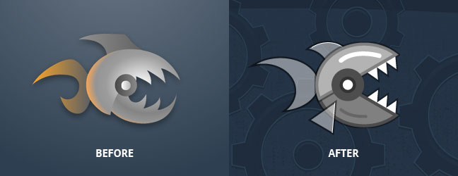
I honestly didn’t know how well the original game’s piranha enemy would translate to the minimalism of Ramps’ new direction, especially since it relied so heavily on a metallic appearance. I decided to capture the translation from start to finish for posterity, sped up for your convenience and enjoyment. I hope you dig it!
We love getting feedback from folks who play Ramps. Here’s a particularly awesome message from a 13-year-old fan, Frankie:
First of all, I love your game. It’s innovative and clean, no lag or glitches and I like the music. But if you want to get your game to be more popular, I would suggest a few things to improve it and raise the ratings. The music Is very repetitive. It’s catchy and goes with the worlds but maybe at least 4 or 5 more songs for each world. Also if you really want to make people happy, eventually obviously, you should add a Level creator and make it good Because I love being creative, and I’m sure a lot of other people would like it too! Also you should be able to share the levels worldwide and be able to download other ones too. This is all in good time of course! And with future updates, adding more worlds and levels would be nice. But you guys really did a wonderful job with everything! Go ramps!
P.S. The more improvements you make the more people will buy it which means more cha-ching in your pocket!!
Thanks so much for your email, Frankie! More music and a level creator would be really cool. Tim and I will definitely be thinking about your comments while we work on improving the game.
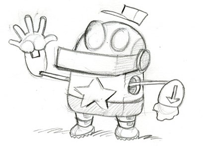
All of my character designs begin in a sketchbook. I find it’s faster, easier and more fun to brainstorm ideas with a pencil than it is with a mouse or tablet.
Most of the characters in Ramps are really simple. I wanted them to be really easy on the eyes and void of unnecessary distractions so that the game mechanics and emotive qualities of the designs could take center stage. This is also just a practical reality of dealing with mobile devices, since oftentimes the characters will be really small.
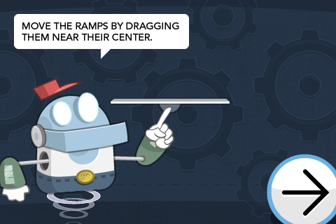
One of the few places I strayed from this was in the “world mascots,” the little characters that provide helpful guidance if you need it. Since they could be larger than most of the in-game objects, I got to explore a few weirder ideas just for the fun of it.

The idea of the little robot maintenance man had been in my head for a little while, so this sketch came very painlessly. Once I started applying him to the world, though, a few challenges arose.
I realized I had inadvertently channeled a bit too much of Homestar Runner with the star on his shirt. Also, I hadn’t thought about how he would exist in a land of lava floors when he had to stand on two feet. Even the Terminator couldn’t win against lava.

I ended up giving him an undershirt and a belt buckle simply because it made me laugh. After a few false starts trying to render dangling legs, I settled on more of a Jetsons-style hovering animation that Tim executed on beautifully.
The World 2 mascot had a different design journey. I’ll be sure to show it in a future post.